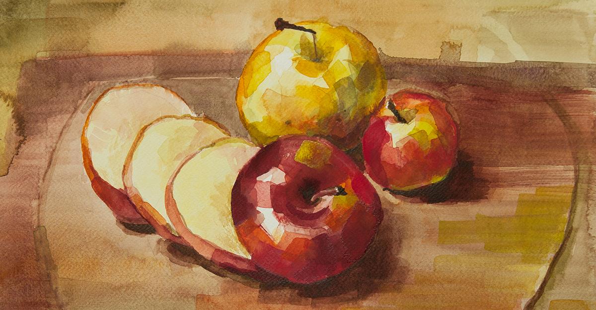
When creating a still life painting or drawing, composition is everything. While technique and expertise are crucial, the subject of a piece is what draws the viewer in and makes them want to study your work.
Wondering how to compose something interesting? We have a few questions for you to consider before setting up your still life scene.
3 Questions for Composing and Drawing a Still Life Scene
What’s the tone of your piece?
Art elicits emotion. Is your piece going to be serious and somber? Exciting? The tone will affect your composition and color palette. Will your elements be placed to communicate action and movement or stillness and contemplativeness?
What’s the focal point?
Which element of your composition should the viewer’s eye be drawn to first?
Are you telling a story?
Will your elements lead the viewer’s eye from one object to another to communicate a message?
13 Tips for Drawing a Still Life Scene
Keep your answers to these questions in mind as you review the following tips for setting up a still life scene. Remember to employ our key design rules, BRUCE (Balance, Repetition, Unity, Contrast, and Emphasis).
- Compose your piece with an odd number of elements. The old rule of designing in threes exists for a reason—odd numbers create imbalance, which creates interest.
- Vary the textures of the objects you choose. Too much of the same is boring, and texture can add as much interest as shape, color, and placement. On that note, your chosen objects don’t need to be pristine or clean. Wrinkles, dents, and even trash can all add interest to a piece.
- Consider the shapes, colors, and sizes of the pieces in your composition. You’ll want to include a variety to provide contrast, particularly when it comes to your focal point.
- You want contrast, but watch the patterns you’ve combined—you want just enough to be interesting but not so many that it’s distracting or overwhelming.
- The placement of the elements in your composition can direct the reader’s eye, either from element to element to tell a story or directly to the focal piece.
- Many artists follow the Golden Ratio or Golden Spiral. Based on the mathematical concept called the Fibonacci Sequence, this is simply a means of keeping elements in proportion to one another.
- Likewise, many artists employ the Rule of Thirds, dividing their scene into three roughly balanced sections horizontally or vertically. This prevents the artist from composing a piece with a front and center focal point and forces some interesting imbalance.
- You’ll also want to ensure your composition has a clear foreground, middle ground, and background to add depth and perspective to your piece. In the case of the ubiquitous fruit basket, you might want to show the floor, table, and wall rather than just the fruit basket in your frame.
- At least some of your individual pieces should overlap. It’s not necessary to draw a whole banana if you can cover part of it with an apple slice.
- Pay attention to the negative space created by your objects. The shapes and shadows of your negative space should be just as interesting as the positive space.
- Playing with the angle from which the viewer sees your composition is an excellent way to add interest. Check out your composition from above, below, and on the side—any of these might be more interesting than the head-on view of your setup.
- While reviewing your angles, be aware of your light source and the shadows and shine it’s creating. If you don’t have any shadows, consider using a light source that will cast some, adding both depth and interest.
- After incorporating these tips, revisit your composition with fresh eyes. You’ll likely need to play with it to get it just right.
Do you teach still life composition techniques in your classes? What other advice do you have for setting an interesting scene? Let us know in the comments!


Leave a Reply