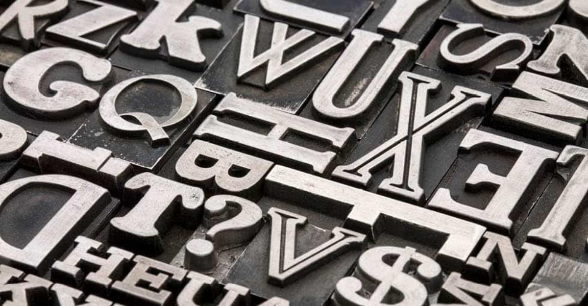
Often confused with font, which is simply the collection of a certain set of typographical characters at a specific size and weight, typography is an art unto itself. This art involves not just the design of individual written characters in a unique and cohesive style, but also the combining of those characters to create messages that are legible and communicate a specific tone.
Consider a few of the typefaces available on your computer. Helvetica is clean and straightforward. Times New Roman has a classical feel. Chiller is accordingly spooky. The typeface you choose adds tremendously to the tone of written content and should be selected carefully, particularly for visual art pieces.
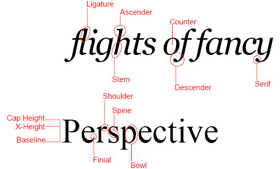
To understand typefaces, teach your students the anatomy of a letter. Gather some examples of words in different typefaces and discuss some of the basic elements:
- Baseline – The line where the bottom of a letter sits.
- Cap Height – The distance from the baseline to the top of a capital letter.
- X-height – The distance from the baseline to the top of a lower case letter.
- Ascender – The part of a letter that extends above the x-height.
- Descender – The part of a letter that extends below the baseline.
- Bowl – The curved part of a letter, as in d, b, or p.
- Stem – The vertical or diagonal stroke coming off a letter or supporting a letter, as seen in the uppercase T or lowercase h.
- Spine – The name of the curves in the letter “S”.
- Serif – The small piece, or foot, that sticks out from some certain letters in some typefaces.
- Ligature – The stroke that blends adjacent letters into one visual character.
- Shoulder – The curve that extends out from the stem.
- Counter – The space between one side of a letter and the other.
- Finial – The narrowing line at the end of a letter.

Once your students have a clear understanding of typography anatomy, challenge them to create their own typestyle following the steps below:
- Define the objective of the typeface. How will it be used? What is it trying to communicate?
- Begin by hand drawing the letters in pencil. It’s helpful to use graph paper in order to accommodate ascenders and descenders and maintain a consistent x- and cap height. If you have a daring group of student artists, encourage them to incorporate a personal interest into their typeface, such as sports or animals, to create their own alphabet, such as the one below.

“Cats Alphabet” available on dafont.com
- Once the alphabet is complete, outline each character with a fine line marker and, if needed, fill in with an art marker.
Have you taught typography to your art students? Do you have any exercises or projects to recommend? Let us know in the comments below.


Leave a Reply