Since roughly 8% of males and 5% of females have some form of color blindness, it’s likely that you will encounter an art student with color perception issues. And, along with matching clothes or picking a ripe banana, color blindness can also pose a challenge in the art room.
What is Color Blindness?
First, we should be clear about color “blindness”. About 99% of people with what is commonly labeled color blindness are actually color deficient, which means they can see color (versus seeing black, white, and gray scale, like the most severe color blindness cases), they just see a more limited, less vivid spectrum of color. By far the most common form of color deficiency is red/green color blindness. Those with red/green color blindness can see blue and brown hues, but not reds and greens.
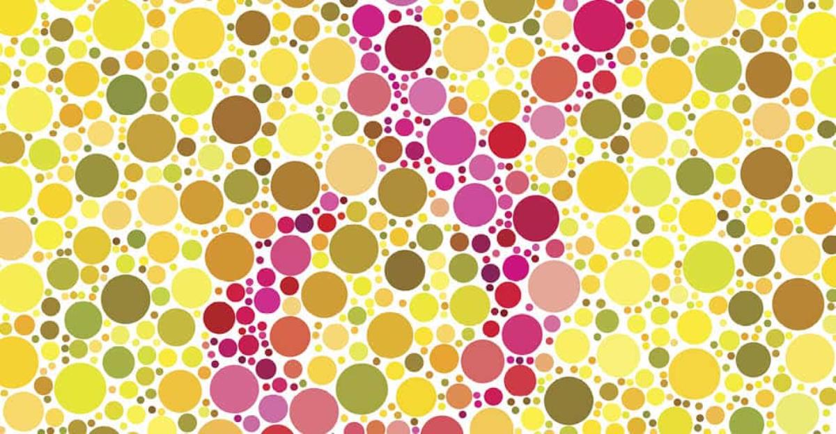
Color perception issues are tested using the Ishihara Color Test, named for the scientist who first identified color blindness. The test involves a series of plates featuring colored numbers and lines placed within dots of other colors. Those with color blindness or color deficiency have trouble distinguishing the colors and lines from the dots – they simply blend into the background.
How Art Educators Can Support Students with Color Perception Issues
While colored lenses or glasses can help improve color deficiency, it can’t be cured, so it’s up to you, the art teacher, to find ways to help your students work around this challenge. And it’s not always a hindrance. Color deficiency can have its advantages, as shared by British artist Neil Harbisson.
Harbisson, who is truly colorblind and sees only black and white, claims that his colorblindness gives him better night vision and allows him to see light and shape more distinctly than other artists. This may be true, as Claude Monet’s ability to see color in later life was limited due to cataracts and fellow French artist Charles Meryon was also colorblind.

6 Tips for Supporting Students with Color Blindness
1. Talk About It
Discuss color blindness as a class, share the causes, and show your student artists a few images to demonstrate how someone with color perception issues might see a specific scene. The image below depicts the way a person with color deficiency might see the ocean.
2. Take the Pressure Off
Make sure your student artist knows it’s always okay to ask you or a fellow student when he or she isn’t clear which color they’re using or which color they “should” use. You might even pair him or her up with a friend who is readily available to answer color questions.
3. Sort Your Materials
Sorting your crayons, markers, colored pencils, and paints into labeled bins or trays goes a long way toward helping your colorblind students choose the correct colors.
4. Label Your Materials
Older students are better able to read the color names on your materials, but they’re not always clear (Chartreuse, for example). Printing out larger labels with clearer color names (Bright Yellow Green) and taping them to your pencils, brushes, and paint pots will help. You might also use a labeled color wheel, particularly if you’re going to be teaching/testing with it this year.
5. Adjust Your Projects
Consider including additional graphite, charcoal, or monochromatic assignments. Occasionally working in shades of black and not having to worry about color will make your student feel more comfortable.
6. Let Them Be
As with beauty, color is in the eye of the beholder. We all see color slightly differently, so why not let your students create with the colors they see? Isn’t that what art is all about?


Leave a Reply