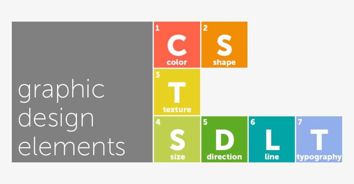
Once you’ve introduced your students to the principles of graphic design, they’re ready to explore the basic elements of design. Check out our easy-to-understand explanations of each of the elements, below:
Color
Color is simply light reflected off of objects. Color has three main characteristics: its hue, or name (red, green, blue), its value (how light or dark it is), and its intensity (how bright or dull it is). Choice of color, value, and intensity can help unify a design and/or draw the viewer’s eye to specific areas of the design.
Shape and Space
Shape is the visibly defined form of anything. There are geometric shapes (man-made) and organic shapes (formed by nature). Something fun to point out in this lesson is that a positive space automatically creates a negative space. You might also encourage your students to try using a ruler or compass to create precision geometric shapes.
Texture
The surface of a shape is its texture. Texture can be created tactilely, through layering of paints and other materials, or visually, through design. Repeating a texture makes a pattern, which is a great way to add continuity to a piece.
Size or Scale
Size refers to the relative scale of the individual pieces within a design to each other. In most cases, the pieces of a design will be in the same scale, unless something is intentionally made larger or smaller by the artist, for effect.
Direction
The direction of the lines add to the overall design. In general, horizontal lines provide a sense of calm, stability, and tranquility. Vertical lines provide balance. Diagonal lines provide movement and a sense of action.
Line
A line is simply two points that are connected. There are two types of lines: those we make intentionally with a brush or pencil stroke and those that are made when two shapes meet. Both contribute to the overall effect of a design.
Typography
Different fonts communicate different emotions and should be carefully considered. As a rough rule, a single design piece should incorporate no more than two different fonts, either two that work together or two chosen intentionally to provide contrast.
Do you have any design tips to share with your fellow art teachers? Let us know in the comments below.


Leave a Reply